
Planning, creating and publishing accessible website content
Continuing Professional Development (CPD) points: 2
This guide is designed to support government communicators who are planning campaigns that require a website.
This includes people who will use the government’s Campaign Platform template and those who use a multi-page campaign hosted on the GOV.UK campaigns sub-domain.
While not designed to be exhaustive, it contains useful information and good practice that anyone planning website content can follow – whether they work in local government, in the public sector or even the private sector.
On this page:
- Planning and delivering accessible online campaigns
- Making the case for accessibility
- How to plan accessible online campaigns
- How to create accessible content for websites
- Publishing accessible web content and web pages
- Key takeaways
Planning and delivering accessible online campaigns
In this guide, we explore how to adopt accessibility good practice in every stage of your digital campaign content strategy. We cover useful things to think about, and the steps you can take during the planning, content development and publishing stages, to help make sure your audience finds your website easy to use and understand.
Following this advice will help you identify and remove barriers that could prevent you from reaching your audience. And in turn, your audience will be better able to access, comprehend and act on your campaign messages.
Making the case for accessibility
Putting audience needs first
Approximately 20% of the UK population have a long-term illness, impairment or disability that somehow affects their vision, hearing, speech, motor or cognitive abilities. The other 80% also have accessibility needs – whether temporary or situational.
Temporary impairments include:
- a broken wrist affecting your ability to use a computer mouse
- an ear infection affecting your hearing
- difficulty concentrating after a concussion
Situational impairments include:
- trying to read a website in glaring sunlight
- attempting to press a lift call button when carrying items in both hands
- completing a complicated task in an environment filled with distractions
- struggling to hear an instruction in a noisy room
- clicking the correct icons in a cluttered list on a mobile phone screen
The important thing to remember is that everyone has accessibility needs.
Accessibility and your responsibilities under the law
Accessibility isn’t just the right thing to do, it’s also the law. If you commission a bespoke website from a third party, it is your responsibility (not the supplier’s) to ensure it complies with the relevant accessibility legislation.
The Public Sector Equality Duty (part of the Equality Act 2010) requires government and public sector communicators to think about how their decisions could affect people who are disadvantaged or subject to inequality.
The Public Sector Bodies (Websites and Mobile Applications) (No.2) Accessibility Regulations 2018 also require public sector websites to be accessible and publish an accessibility statement.
How to plan accessible online campaigns
Step 1: Include accessibility in your OASIS plan
You should build accessibility into your campaign planning. Ideally, it should feature in both the Audience Insight and Implementation phases of your OASIS plan and not be something you only think about when you come to launch your campaign online.
Teams can use the Inclusive Communications Assessment template (ask the development adviser in your department for the GCS password) to identify potential blockers or barriers in your proposed channel mix, and better understand the target audiences’ accessibility needs.
Step 2: Develop accessible campaign branding
High-performing campaign brands are eye-catching and memorable, helping to attract attention and make key messages stick. They also support a clear and compelling narrative, helping to influence behaviour or perceptions.
Developing an accessible campaign brand and visual identity supports those aims. Use these 5 inclusive campaigning principles when developing your campaign brand.
Step 3: Develop a clear user need to keep your audience front of mind
A good ‘user need’ can act as a helpful anchor for your content by distilling aspects of your audience insight, campaign objectives or desired ‘think, feel, do’.
For example, this is the user need we used to develop this guide:
As a government communicator who manages campaigns
I need to understand how to make online campaigns accessible
So I can communicate effectively with my audience and avoid breaking the law
The Government Digital Service (GDS) provides advice on how to develop user needs.
Grounding your content in a defined user need helps keep your audience front of mind. It can also help facilitate meaningful conversations during the approval process. You can link content decisions to the user need as a rationale when discussing amends.
How to create accessible content for websites
Making your website content accessible goes beyond just the words on the page. It also includes things like images, videos, charts, tables or banners, and even the links and buttons people use to take action on the page.
In this section, we explore how to improve the accessibility of the core aspects of your on-page content.
Accessible language
Research suggests that people read between 20 to 28% of the text on a page, so making your content concise and easily “scannable” is important. Here are some tips to bear in mind:
- free online readability testing tools allow you to test the readability of your content and make sure it is accessible to those with lower levels of literacy
- use plain English and refer to the GOV.UK Style Guide for advice on complex words or phrases to avoid
- keep sentences short (25 words or less)
- free tools like the Google Search Console can identify relevant keywords and genuine queries that are driving the type of traffic you’re trying to attract
Read: How users read on the web
Read: Writing for GOV.UK: how to write well for your audience, including specialists
Accessible page structure
Avoid long, complex paragraphs which create intimidating “walls of text” that are challenging for people consuming your content on smartphones and people with cognitive disabilities.
You should also not use bold, italicised or capitalised text to “break up” your content, and instead use proper document structure as explained below to help people easily navigate your page:
- make sure your website has a unique page title that explains clearly what the page is about
- use headings to create a logical page structure and assist people who use screen readers to navigate content in a consistent, linear way: Heading 1 (or H1) should introduce the content, then use Heading 2 (H2) as headings for a specific section and Heading 3 (H3) as a subsection within a section.
- The order should be sequential, for example, H1, H2, H3 and not H1, H3, H2.
- do not justify text – it should be left aligned
Tip: using target keywords in your headers can also help to support search engine optimisation. Short, functional and descriptive text works best for headers.
Accessible links
Any links or URLs you feature on your website need to make sense without the context of surrounding content, such as the rest of the sentence in which the link appears.
A page that features several different links which each say “click here” will be useless to a screen reader user because it gives no indication of what link goes where. Link text should tell users where they’re going and why.
These are examples of some good, bad and ugly link text:
Good: read guidance on applying for a driving licence
Bad: read more
Ugly: click here
Good practice to follow to meet legal accessibility standards includes:
- making links stand out from other text by underlining them and using a different colour to other page content (using a 3:1 colour contrast ratio)
- starting with a verb if you’re telling people to do something. For example apply for a passport
- linking directly over the text if you’re linking to information. For example, find out about types of election
To learn more about formatting link texts, read the GOV.UK content design guidelines.
Accessible document formats
As a general rule, content being published to websites should be published in HTML by default. It’s important to think about accessibility across the whole of your user journey including any documents you link off to or ask people to download.
Following this guidance on publishing accessible document formats is a positive step to ensuring your whole user journey is accessible.
PDFs are a format designed to be printed – not to be read on screens – which means they are not responsive and are difficult to open or navigate on mobile devices or using assistive technology. It can be challenging to make them accessible. This blog explains more about why content should be published in HTML, not PDF.
The use of colour and colour contrast
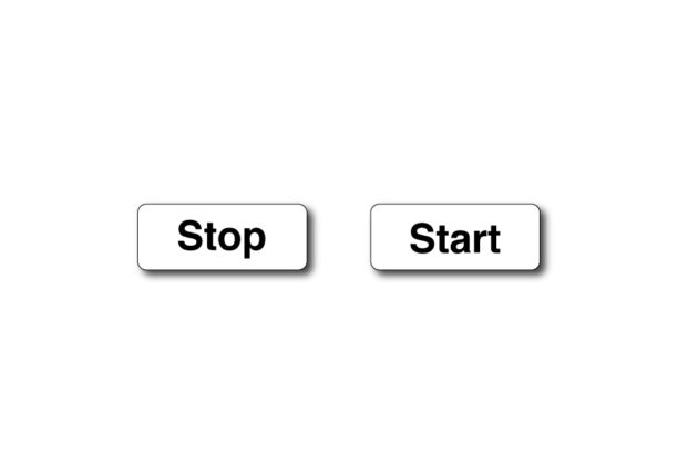
Colour can be used to add emphasis and to engage, but should not be used in isolation to convey a key message. Relying on colour to convey a message makes the content inaccessible to people who are colour blind.
This example is accessible because it does not rely on colour to convey a key message.

As you can see, removing the colour does not alter the meaning.
Compare that to the below. The message is no longer comprehensible or clear to anyone, particularly those who are colour blind or are unfamiliar with “green means go, red means no”-style cultural references.

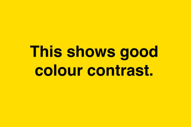
Colour contrast is another important accessibility requirement. It’s important you make sure there’s a minimum colour contrast ratio of 4.5:1 between text colour and the background it appears on.
Here is an example of good colour contrast:
Here is an example of poor colour contrast making the content less accessible:
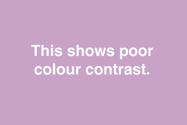
Tip: This free colour contrast ratio tool will help you to check the colours you are using for your campaign.
Making images, videos and GIFs accessible
Images, GIFs and videos serve many purposes. They can be purely decorative or create a sense of campaign identity. They can be used to break up text on the page. Or they can convey essential information and if they do, they need to be accessible.
Alternative text (“alt text”)
Alternative text, more commonly referred to as “alt text”, is a short written description that helps explain images or other visual components to users of assistive technologies, like screen readers. It is added in the content management system (CMS) of a website.
Good alt text is short and simple and only includes the information people need to know about the message the image is conveying.
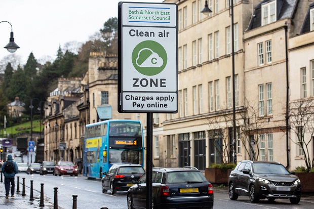
For example, alt text for the image below could read: “A street scene showing cars, buses and pedestrians in the Bath and North East Somerset Council Clean Air Zone.”
Good alt text should:
- let people know what information the image provides
- describe the contents of the image
- be short, meaningful and specific
- feature standard punctuation like commas and full stops.
Follow the GOV.UK Design System’s helpful guidance on when to use, and how to create, effective alt text for images and infographics. The Office for National Statistics (ONS) also publishes information about how to publish accessible charts, tables and other diagrams.
Tip: You don’t need to include things like ‘picture of’ or ‘image of’ in your alt text descriptions.
Tip: In addition to making sure you have the correct licence and copyright permissions to feature an image on your campaign site, you should also consider the quality of your images and how they might appear if shrunk down on a small screen or magnified by a screen reader.
Accessible videos and animations
Videos and animations rely on people being able to access and interpret both visual and audio cues. A video with a voiceover but no captions would be inaccessible to a deaf person. An animation with no voiceover and only words on screen would be inaccessible to someone with a visual impairment.
That’s why it is essential that you include both a voiceover and either subtitles or closed captions in any video or animation content.
Your voiceover should have a minimum difference of 20db (decibels) between it and any background audio or music. And your subtitles or closed captions should use a clear font (Arial is good) with white text on a black background.
When developing videos or animations you must make sure:
- automated transcriptions and subtitles are quality-controlled and checked to ensure they accurately reflect the video content
- to consider video and animation transition times so people can follow the content, taking into account an approximate reading rate average of 200 to 250 words per minute
- subtitles and captions are readable and that there’s at least ⅓ colour padding between the text and background edge and that white text is shown against a dark grey or black background
Find out more about video subtitling for accessibility.
Tip: YouTube subtitles are created as SubRip Subtitle (“SRT”) files which can be downloaded and used to apply subtitles to other video file types or create transcripts.
Flashing images and gifs
Flashing images and gifs can be distracting and – in some instances – trigger seizures. If you plan to use flashing imagery on your site, you should test your content to make sure that nothing flashes more than 3 times per second. You might also need to consider whether a trigger warning is required before the content is shown.
Autoplayed content
Content which automatically plays on the page can be disruptive for people with visual impairments who are using screen readers because audio can interfere with the voiceover tool that explains the page content. It can also be distressing for people with cognitive or sensory sensitivities and be a barrier that prevents them from reading or understanding parts of the page.
As a minimum, you should offer a pause or mute function that is obviously and immediately accessible if you plan to use auto-played content on your page. It is good practice to give users the choice of whether or not to play the content in the first place.
Publishing accessible web content and web pages
Following the guidance set out above should help you deliver a user-centred, accessible content strategy for your campaign site. Here are some final reminders of things to consider before you launch your site or publish content:
- Follow the GOV.UK content design guidance and make sure alt text is published for any relevant images or visual content.
- Cross-reference your content against the GOV.UK Style Guide.
- Check your design elements against the good practice contained in the GOV.UK Design System and W3C.
- Use CMS page structure tools to add headers. Don’t fall into the old habit of replacing actual headers with bold or underlined font.
- Check hyperlinks work and are labelled using accessible link text.
- Test how your content displays on different browsers and devices and, if you have the resources, with different assistive technologies.
- Check you have followed these 4 steps under the Public Sector Accessibility Regulations and have published an accessibility statement.
Key takeaways
Developing digital capability within the communication profession
Much of the good practice outlined above is driven by an active community of content designers and designers within the digital, data and technology (DDaT) profession but has clear implications for those working in communication roles.
If you are interested in deepening your understanding of accessibility and content design, the following free resources and training can help you to stay up to date with the latest thinking and develop your capability:
- Content design publishing guidance (including the GOV.UK Style Guide)
- GOV.UK Design System
- Accessibility in Government blog
- Introduction to Content Design Course
Templates, tools and resources
- Advice on how to develop user needs
- Deciding whether you need to use alt text
- Checking colour contrast
- How to check if an image has alt text
- How to set up a new government campaign online
This guide was developed by the Government Digital Service (GDS) in partnership with the Government Communication Service (GCS) and the Central Digital and Data Office (CDDO).
- Image credit:
- Government Digital Service (GDS) for all graphic designs (1)